Red, orange and yellow facade cladding on apartment building
Orange, white and grey coloured facade on apartment block
Exterior of modern rest home

Why is colour specification so important for facades?

Colour is more than just decoration. It is a huge influence in how humans respond both physically, mentally and psychologically to their surroundings, something which is incredibly important in creating good quality contemporary architecture.

A considered application of colour is not a modern architectural trend. It has been discovered that Ancient Greek temples were not the neutral stone structures that we picture, but they were in fact painted in symbolic, rich jewel tones which represented the public’s adoration of their gods[1].

The Power of Colour

Colour specification needs to be a major consideration when looking at a building’s function, the experience of its users and how it fits into the local environment.

As colour has the power to stimulate or sedate the human brain, the right hue used for external cladding and other surfaces can be the key to creating the appropriate mood, establishing emotional connections to a space and inciting a sense of wellbeing.

Choice of colour can also be motivated by what architectural statement the designer wishes to make. Do you want to use colour on the curtain wall to make passers-by take notice or make your design blend into its surroundings? Do you want to use a combination of colours to highlight one area of a building and hide another?

Colour can alter sensory perception and affects the illusion of space, with more intense colours making areas seem smaller, whilst more muted tones give the effect of a larger surface. 

An Individual Experience

The beauty of colour is that it possesses a visual language for modern architecture which can be understood internationally. Many colours trigger a learned response, such as red meaning “stop” or “danger” due to its use on road signs and traffic signals, and its link to the colour of blood.

However, we must be wary of certain cultural differences and how interpretations of colour can be influenced by various associations, including politics, history, religion and linguistic expressions[2] (e.g. “green with envy”, “feeling blue”). For example, white symbolises purity in Western culture so is the traditional choice for bridal gowns, but the colour symbolises death in Eastern culture and is often worn to funerals.

The feelings associated with colour can also be related to an individual’s own lived experiences, their personality and preferences, such as the colours worn by their favourite football team. In general, younger people and those with extroverted personalities prefer primary and more saturated colours, whereas older people or introverted personalities prefer more subdued colours.[3]

Exploring The Spectrum

Let’s take a closer look at common interpretations and attitudes towards colours which can influence how they are used in architecture and design.

Red

The most dynamic and exciting colour in the spectrum, red is eye-catching and ideal for drawing your attention to a specific area. It is often used for fast food outlets and other commercial spaces as it triggers a sense of compulsivity and consumer desire.[4]

However, use cautiously as it can also appear aggressive and intense, with connotations of danger and blood. The light wave energy of a colour causes a biological reaction, and as the eye has to adjust focus to see red, it has the visual effect of appearing closer than it is. Did you also know that a person’s heart rate will increase when exposed to the colour red, even when they are blindfolded? [5]


Orange

Orange possesses the warmth and attention-grabbing qualities of red but with more positive associations. A vibrant, saturated orange (such as SVK Decoboard and Ornimat cladding panels in Sunrise) is ideal for creative environments thanks to its bright and friendly energy.

Yellow

The happy colour! The primary colour of yellow is inspiring and cheerful rather than overwhelming. This sunshine shade is understandably a popular choice for child-centric environments such as schools and nurseries.

Chosen as The Pantone Colour of the Year in 2021, it's an excellent example of the power of yellow. The combination of Ultimate Grey and Illuminating was chosen to express fortitude and strength, lifted by positivity and energy.[6]


Blue

Calming and cool blue is proven to decrease an individual’s blood pressure and heart rate[7], making it the ideal hue to create comfortable and secure environments. Frequently used for exterior cladding and interiors in commercial spaces and offices, blue offers the illusion of depth. Blue light also slows down the body’s production of melatonin, which can help increase alertness.


Green

Whilst maintaining a sense of vitality, green is a tranquil and relaxing hue, with connotations of wellbeing and sustainability. In environments where there is a lack of nature, a green facade can bring the feeling of it to a scheme.

Contrary to red, green is the most restful colour to the eye, as the eye focuses exactly on the retina when looking at it.

White

White is incredibly popular in modern architecture thanks to its ability to create clean, crisp and simple structural statements and dramatic shadows. Representing fresh beginnings and mental clarity, white rainscreen cladding panels can act as a blank canvas which allows other elements of the construction to take centre stage. This versatile choice can appear sterile or lacking energy if not applied correctly.


Brown

In a similar way to green, the colour brown is intrinsically associated with nature, representing the earth, mud and dirt below us. Whether through wood, brick or coloured cladding boards, brown is a grounding colour which gives a sense of stability, security and honesty.


Grey

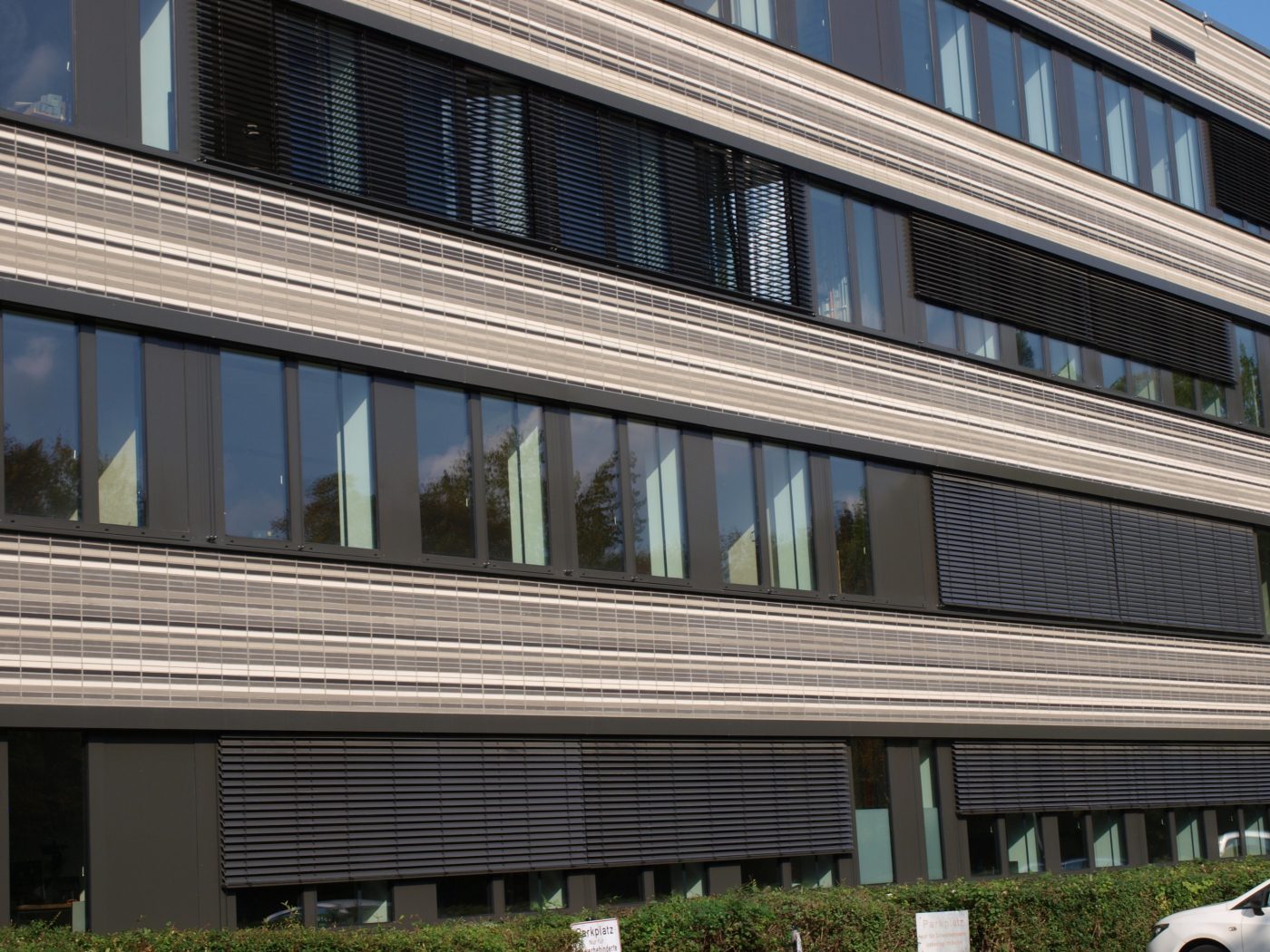
Often labelled as a “non-colour” (or the technical term “achromatic”, as it is only made up of black and white), grey is another popular architectural choice as it represents balance, steadiness and sophistication.

Utilitarian and industrial, grey offers cohesion with surrounding architecture and a feeling of conformism, thanks to the association with grey suits and workwear.

Grey acts as another neutral option for architects thanks to its appearance in many construction materials, such as stone, concrete, steel and tarmac. Take a look at this article for a closer investigation into the trend for raw materials.


Black

Black can make an extremely powerful architectural statement and also create the visual illusion that something is receding. Due to the association with death and grief in Western culture, its use should be well thought out, so spaces don’t appear gloomy or dungeon-like. 

When specifying colour choices for a project, an architect needs to think of the design holistically. Whether a colour increases the wellbeing of the space’s users, or has a negative effect, all depends on the context and application. Designers need to consider the intensity of the hue, positioning, light conditions and many more considerations.

Thankfully, the SVK fibre cement facade panel range offers plenty of choice through its wide spectrum of colour options, from vibrant brights to subtle neutrals, to help you create the architectural design statement you envision. The collection doesn’t finish with a portfolio of standard colours, as Ornimat fibre cement cladding orders of over 50m² can be manufactured in almost any RAL or NCS colour. 

Find out more about SVK Fibre Cement Facades

Browse the full SVK range and complete the enquiry form to order your samples


Sources

Downloads

Search now to download product information, technical guides, brochures and more

Contact

Got a question? Send us a message and we'll be in touch to help.

Stockists